...consists of two spa hotels in Pärnu - Tervis health spa hotel, which has been offering professional spa treatment for over 50 years, and the four-star Tervise Paradiis hotel, located in close proximity to the sandy beach in Pärnu, with the largest water park in Estonia.
Our MISSION is to guide people to value their health. Our VISION is to be a known and acknowledged carrier and developer of spa traditions in the Baltic Sea region as well as a preferable destination to spend a healthy holiday in Estonia.
The rules for Tervis Spa Group's visual identity are not complicated - they are handy tools. They can be used to design environments that are similar in nature and impression, as well as sustainable communication - no matter what campaign or channel it is.
No graphical system is ever completely ready, as no one can foresee all situations. If at some point you come across a question that cannot be answered on this page, ask for advice from the Tervis Spa Group marketing department. There are no unsolvable situations. Reasonable dialogue and substantive analysis of existing tools consistently yield the best results.
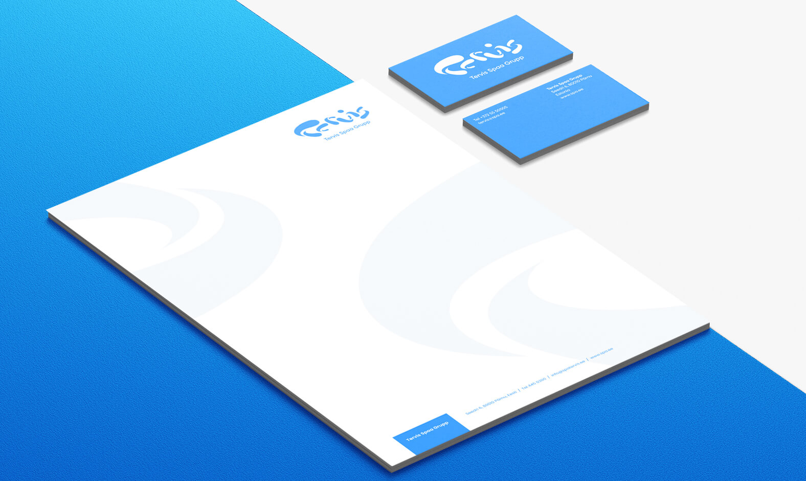
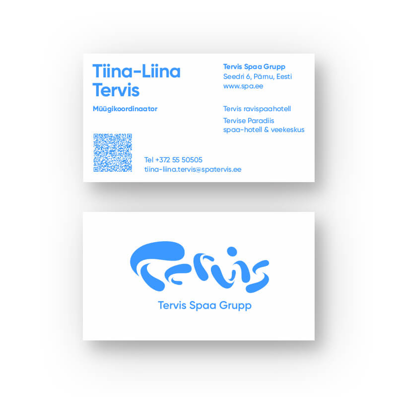
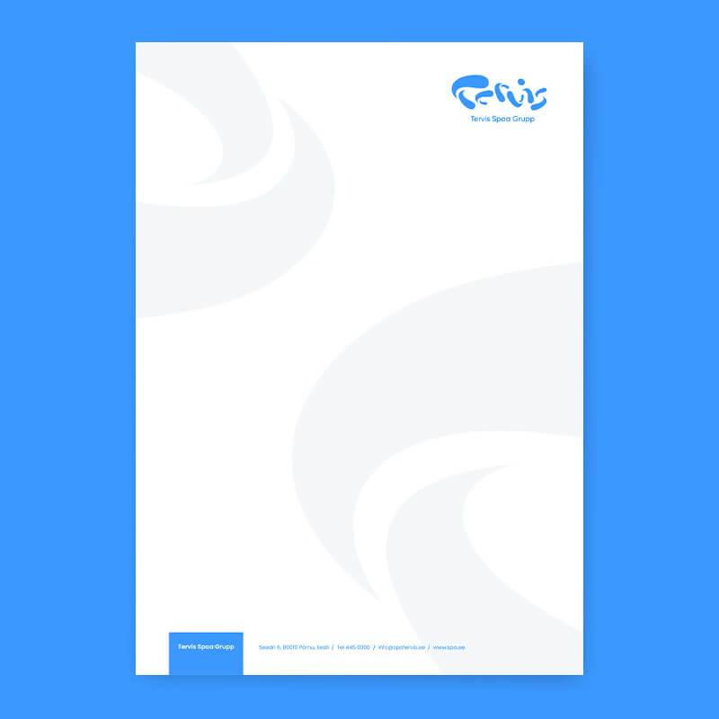
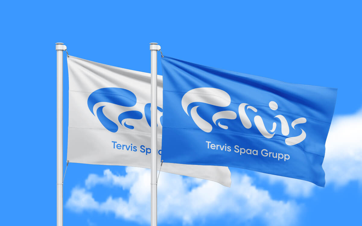
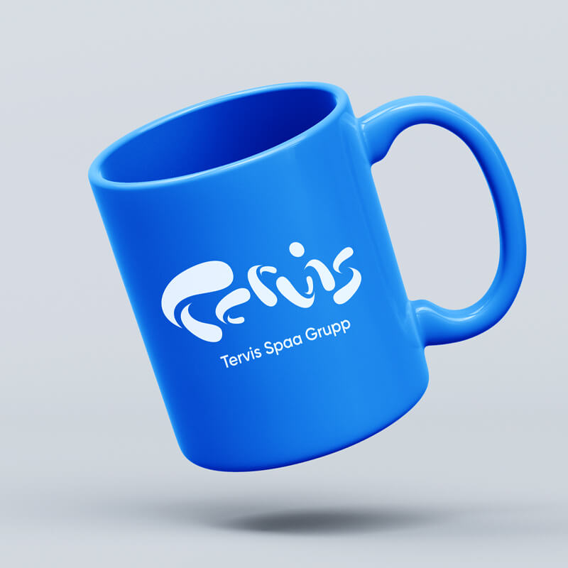
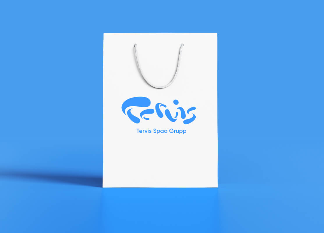
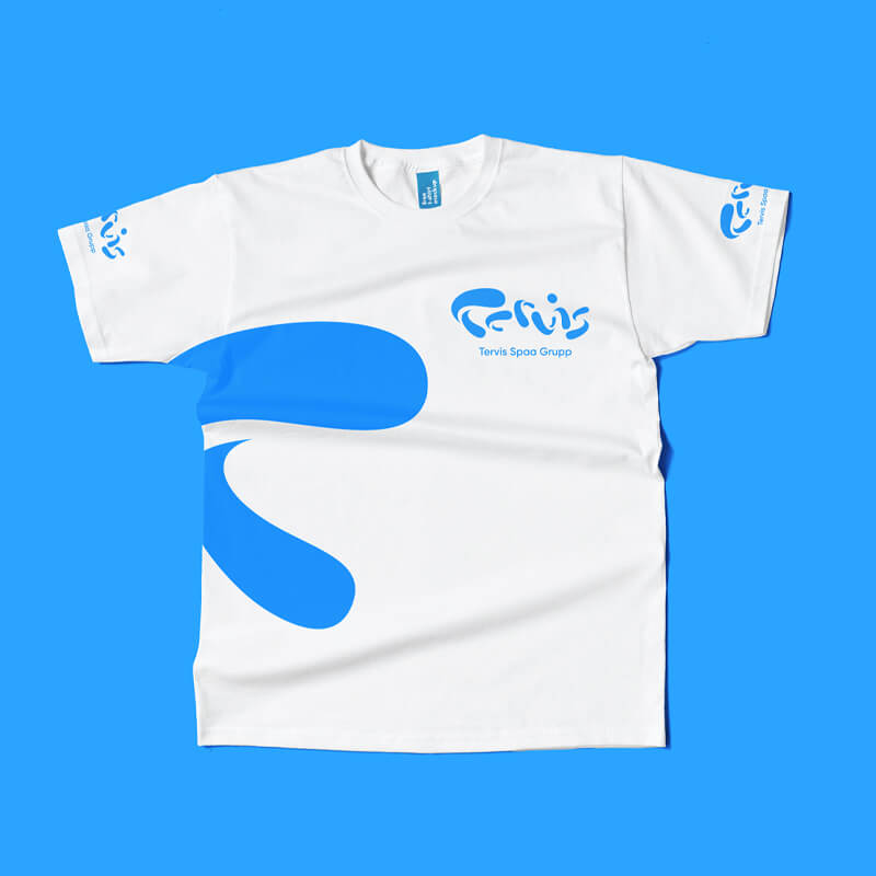
The logo of the Tervis Spaa Group consists of a symbol and a name extension. The logo symbol represents the movement of water in the shape of the letter T. The logo symbol represents the movement of water in the shape of the letter T and visually conveys the qualities attributed to water, such as freshness, clarity, change, health, alertness, energy and plastic movement. This message is also supported by the use of corporate colors with white.
Logo symbol is the signature of Tervis Spa Group – the essence and beacon of the brand. The logo represents the movement of water in the shape of the letter T and visually conveys the properties attributed to water - freshness, clarity, change, health, alertness, energy and plastic movement.
The logo and the lettering have a mandatory proportion and placement. The mark is also allowed to be used as a separate corporate identity in situations, but only in situations where the logo needs to be displayed on a particularly small surface. It is also permitted to use the mark separately as a decorative element in other cases (backgrounds, patterns, ...).
The name extension consists of the name 'Tervis Spaa Grupp' (or its translation) written in capital letters on one line in Gilroy-SemiBold font.
In addition to the Estonian logo, it is also allowed to use logos with a foreign language extension. Initially, there are 3 foreign language logos - English, Finnish and Swedish.
If necessary, it is allowed to create more, in which case only the descriptive text will be translated into the foreign language (using the font of that language)
The Tervis Spa Group logo is only allowed to be positioned horizontally.In the case of a vertical position, the symbol is placed above the text block and they are aligned on a common central axis. In the case of a horizontal position, the symbol is placed to the right of the text block.
The minimum permitted size of the Tervis Spaa Group logo is determined by the height of the vertical logo and the width of the horizontal logo - 20 mm. If the logo is smaller than this size, the mark may be used separately. The minimum permitted height of the mark must not be less than 4 mm.
The 'breathing area' is the minimum free space surrounding the logo, within which no other graphic elements may be placed. The 'breathing area' measures 2x the height of the name extension on all four sides.
A black and white (monochrome) logo can be used in cases where it is not possible to use a colored or corporate blue color. The tone of the black and white logo can be either 100% full color or 50% color raster.
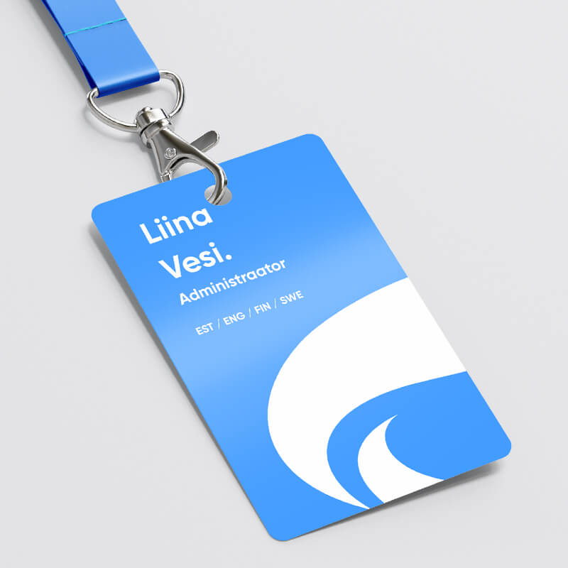
The corporate color of Tervis Spa Group is paradise blue. The main companion of the primary colors is white, which emphasises contrast and clarity.
Tervis Spa Group corporate primary colors and accent colors can be used in additional surfaces or additional details (not directly in contact with the logo) in addition to the full color, also in 75, 50 and 25 per cent. The background of the logo must not be a percentage dilution of the same color palette.
!! Use low-contrast colors for the logo/background - white + sand yellow or white + blue!! Do not use ballet shades of the same primary color in the logo and background!!! Do not twist or bend<!! Do not rotate or tilt!! Do not stretch or compress!! Do not use on a colorful background without a background box!! Do not use a contour line!! Do not use a foreign color!! Do not add effects
The corporate font of Tervis Spa Group is Gilroy. Three weights are used: Bold, SemiBold and Regular. Gilroy Bold with a continuous capital letter should always be used in titles. Gilroy SemiBold or Gilroy Regular is used for all other texts.
Download Gilroy fonts here https://font.download/font/gilroy-bold


If for some good reason you cannot use the Gilroy font, it is allowed to use the Poppins font as a substitute font.
Download Poppins fonts here https://fonts.google.com/specimen/Poppins


Visual examples of graphics.
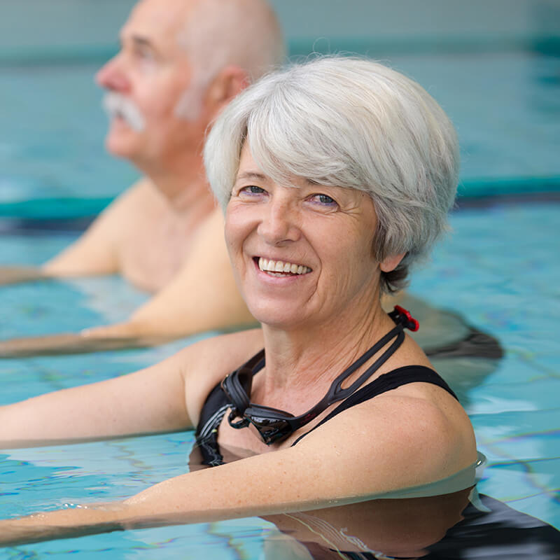
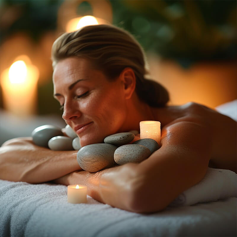
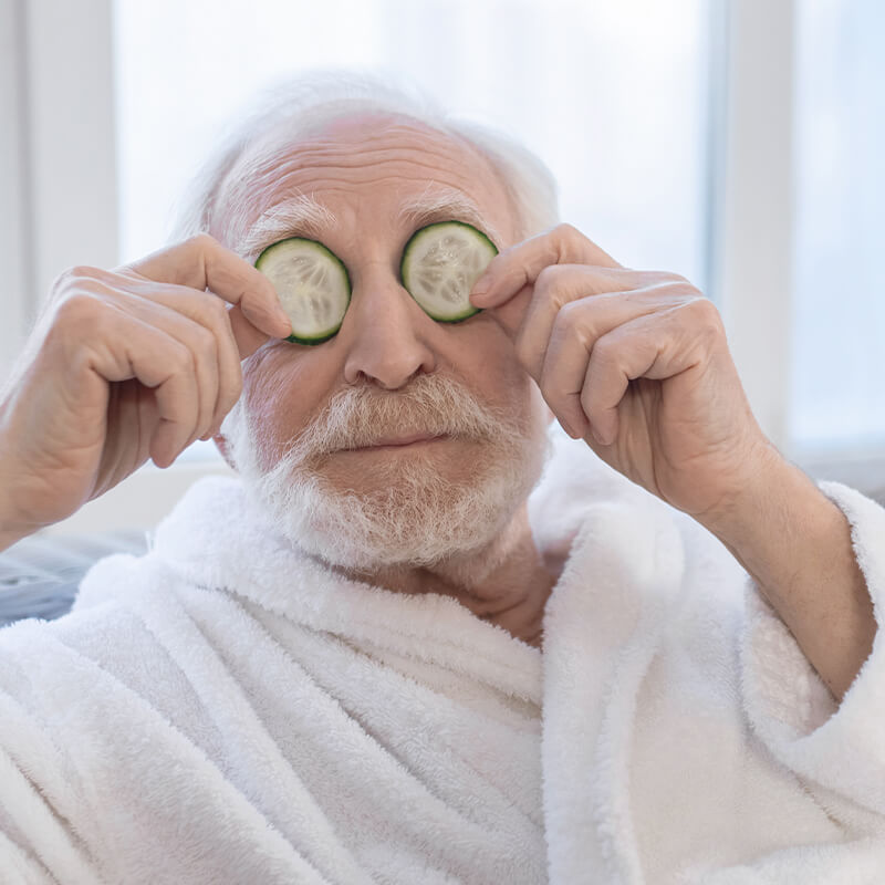
The visual language of Tervis Spa Group's communication is always associated with positive emotions - satisfaction, pleasure, happiness, love, gratitude. What is depicted in the images should be associated with beautiful moments, right choices and a positive environment. The visual language should never be aggressive, leave an arrogant impression or cause negative feelings such as fear or sadness. The color scheme of the images is rather clear and in strong tones.


From this section you can download the Tervis Spa Group logos in PDF, JPG and PNG formats, as well as the Gilroy and Poppins font families.

